Tuesday, 28 February 2017

Monk (Edit Practise)

Monk (Edit Practise)


We were tasked with making an edit using the video files from the film monk, it was to show us how each person has a different style of editing. I chose to make mine a more meaningful scene by showing expressions of the two actors faces after each said something.   

The opening shot was an establishing shot to show the audience where they are, so that they have some context of were the rest of the shots will be. It then leads on to a back and forth conversation that the shots over lap one another to show the expressions of the actors whilst keeping what they say and the expressions of them saying it. It then starts to speed up as they almost end up in an argument weather or not he will except the invitation at around 25 seconds. I then decided to let the shots last longer and longer as it got more serious. Then as he says that they have ran out of time at about 55 seconds the shots start to decrease in length until the final shot were it shows the stressful thinking of the actor. 
In my original edit i was given some feed back to remove some of the hard cuts and overlap some of the audio and videos so that there is a softer transition making it seem as though the shots last longer. 
Before:                                           After:
                     
Here is the hole timeline:


Then i was told that towards the middle, the shots kept changing to quickly so then i decided to cut a couple out and stretch the others to match the audio of the files that were originally there.
After doing this i was given some good feed back from other students who said they liked the length of the shot changes through out and that the audio fits really well with the shot changes and expressions.

Here was the original scene:


Monday, 27 February 2017

Course Reflection

Course Reflection
Over the course so far I have learnt a lot and feel that it will help me to get to were I want in the future. Overall i have noticed a few patterns, one being that i am good at and enjoy moving image and animation which shows that i am good with computers and driving a story forward. another pattern is that i don't like publishing, well its not that i don't like it its just i don't enjoy it as much as moving image and animation.


For my FMP i think i will do something that includes animation and moving image, maybe it will be a film that is live action that then uses animation to explain things.

Interactive reflection

Interactive reflection
Looking through the work that i did for my interactive lessons over the last term i am fairly pleased with what i have done, however there are some things that i wish were done better or had been done on top of what i have. These include finishing off making my animation interactive with buttons that make my character do certain things, i didn't have enough time to finish programming and setting it up though. 
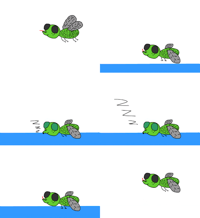
I was very happy with the animations that i made, my character was called Freddy the fly and i made animations of him playing which is when he does a loop in the air.

Then i made one of him eating where he drops down on to a table and eats some pooh then fly's back up.

Finally i made one of him sleeping were he drops down on to a table falls asleep then wakes up and fly's again.


Also theres the animation of him not doing anything i.e. being idle but i cant seem to find it.

Then i also did some sketch book work that i was ok about but i don't feel that is was the best of my ability when it comes to drawing and if i had more time to draw them i could make them better.

Also earlier in the term we experimented what animate to learn what the tools do and overall i feel that i know most of the way around animate and can do anything on there given enough time as i am not the best drawer, but i happy with how much i have progressed with animate and hope to have the opportunity to use it again. 
Here are some of the experiments that i did on animate:
here is a bouncy ball that helped me learn the timeline and keyframes in animate.

here is a drawing of a bunch of penguins which helped me learn the drawing tools.

here is an animation of two cars racing which helped me learn motion Tweens however they weren't very successful as the wheels are not smooth and it is not exactly a race.

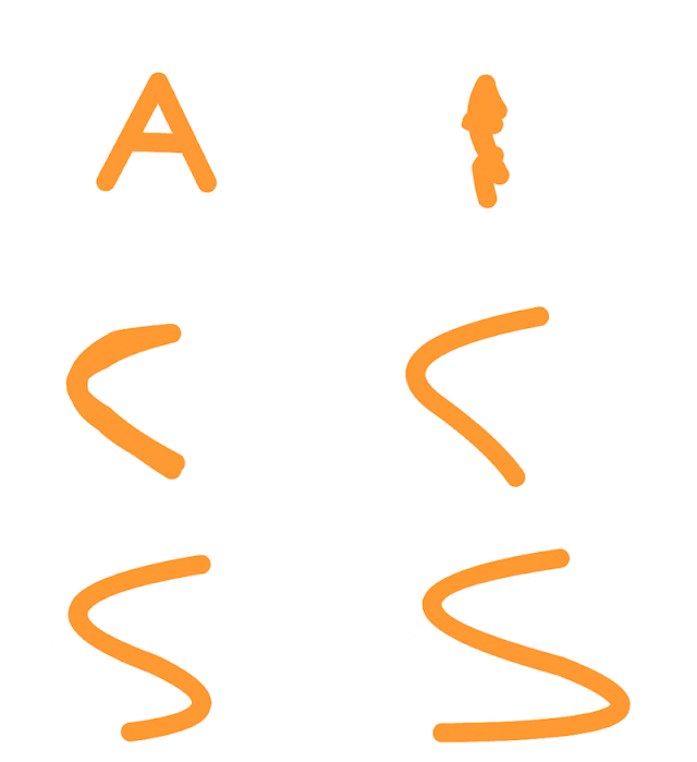
here is an animation of my initials which i made to teach me how to use shape Tweens i was fairly pleased with it.

here is the first animation i made of Freddy the fly when i was still deciding whether or not i was going to use him, it is of him waiting or being idle.

It could of been smoother on the other hand as and the climax of him flying up there is a slight Jutter which i am not happy with but overall it is a good animation.

Tuesday, 21 February 2017

The Decision Final Evaluation

The Decision Final Evaluation
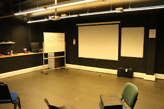
I was fairly pleased with my final result of The Decision however if i could go back and do it again i would make some major changes, for example i would spend more time experimenting and finding more suitable locations to shoot like a proper classroom of some sorts in stead of a dark drama studio, leading me on to the next change i would do and that is lighting i would add more lighting the video as in the room i filmed it was very dark which helped give a feeling of it being very serious but it would of been good to have the option of more lighting that i could control. Another thing i would change is to get the props i need i.e. a computer instead of making do and using a phone, as in most of the shots were there is typing on the phone there was originally meant to be a computer.

Now going on to blogs and pre-production stuff, if i had the chance to do it all again, i would focus on recording and taking photos of what i did lesson by lesson and write down more detail in each of the blogs and add photos to help visualise what i did. i would also spend more time creating the storyboard and concept art.

Overall i am not happy with the amount of work i ended up as when i was making it i thought i had made at least double what i actually have as i put lots of effort in to making what i have but now looking back on it i should of done more. this is good experience though and i now know how much work i need to do, i feel that i have learned from this. I also know now that i need to evaluate more on all of my work and explain what is bad and what is good.

I underestimated the amount of pre production work that needs to be done but at least i now know that i the amount of work i think i need to do i should just double or even triple the amount and do the same with the amount of detail. 

Look book Peer Assessment

Look book Peer Assessment
Overall I agree with the feedback I have been given on my look book and my brand I feel has been represented well by it.
The main Improvements I was given was to remove a couple of spelling mistakes and make sure that the photos in the background are not pix elated, also to make some borders around some of the design photos and to change the white background of the text as it looks rushed and half done, finally to keep the font consistent.
However they said that they like the look book overall and the designs were good and represent the brand well, they also said they like the background photos as they GO along with the inspiration for the brand and designs, also that it is a very male dominant brand which it is, so that is good.
Overall the most liked thing about it is the brand logo as it shows off the brand well and they liked the use of two different languages (English and Japanese). 


Saturday, 11 February 2017

CV Advice

CV Advice
I spoke to the futures team and showed them my CV the advice that I was given to change my CV was to remove my date of birth as it is age discrimination if they don't hire me for that reason. also they said to change the lay out to make it easier to read and find the important bits.

here is my CV before:

And here it is after:

Thursday, 9 February 2017

Recording sound for The Decision

Recording sound for The Decision

I had a couple of options for recording audio for my film. i could of used a boom mic, the on board mic on the camera or a Rode video mic. In the end i decided to use the Rode video mic as i thought it was the easiest with decent quality, as it made it easy to match up the audio with the footage whilst still having good quality sound.

I also just used the sound that was at location when filming as it was not bad quality and i had all the background noise i needed so i didn't do any Foley, which meant that i could have more time to edit.
However i did re-record some dialogue using the rode mic as it was all ready set up and easy to use, i then over dubbed the dialogue to the footage.

Sleeping animation

Sleeping animation

Eating animation

Eating animation

Playing animation

Playing animation

Tuesday, 7 February 2017

Mood Board & Consept Art

Look Book Final

Look Book Final
For my final design of my look book I decided to add some photos that I feel represent the brand in the background as my photo shoot was all done in a studio. 
I feel that my look book represents my brand and designs quite well as my brand is called Short Temper, I have an axe as my logo which is usually associated with aggression which is what happens when you have a short temper. The rustic look of my look book also helps give the message across as quite manly and aggressive as a brand, which is good as the brand is male dominant.

I chose this rocky background for my front cover as it shows a rustic but aggressive feel to match my logo which is simple but possesses similar values. In my peer assessment people said that they liked the logo as it was simple and left an impression, also that it uses two different languages (English and Japanese).
 
Here I put the brief description of what my brand represents and why I chose different logos and designs. also I have the concept art of my t shirts here and how they are supposed to look. I was told in the peer assessment that the text on the second page was hard to read as it had a busy background, they said I should put it in a text box, however not a white one like I had done as it looks rushed and unprofessional.

Here I have the concept art of the hoodies I chose to make the grey white on the concept as it help show the designs on the hoodie it's self. Then next to that I have the first photos from my photo shoot which I feel shows the designs off well in the studio, but finding a location to shoot would of been good but then you have problems with getting lighting equipment there and getting everything to sync up. I chose to have a darker warehouse as a background photo as the hoodie is fairly light in colour. Again in the peer assessment I should change the text box colour. The photos of the final design I actually made on photo shop to make it look like the hoodie is actually printed I blurred the design a little then I used the burn and light tools to make the design match the creases. Some of the feedback I was given was that the designs on the garments were real. 

Here I Have the photos of the black hoodie and the black shirt but for some reason the black hoodie has come out a little grey in the look book but the real design is black. I chose to have a lighter background as the photos are of black objects. I was rather proud of my photo shop work on the photos of the dark hoodie as I selected with the magic wand tool the hoodie and the not the design, neck or background and I adjusted the image by changing the light and exposure which made the light grey hoodie it was originally, to black. 

Here I have the design of the white t-shirt but I ended up rushing to get the final page done as I ran out of time that is why it doesn't look as good as the others and there is no background photo. I would of done the same thing with the t-shirt as I did with the hoodie but instead of turning it from grey to black I would of turned it from black to white.

Look Book Design

Look Book Design
For my look book i needed to put in concept art for my designs a brief description of why i chose my brand name and my designs, finally photos of my garments from a photoshoot.

This is a rough look of what my design would look like:

Sound Scape

Sound scapeI thought about what the world would sound like even in silence for my film and i came up with a few sounds that i feel would be important to give my film a realistic sound and feel.
Here is the list of some of the sounds that i feel should be in my film according to the script:Walking
Buzz from the computer fans/vents Clicks of the mouse and keyboardSound of the board pen on the whiteboard The sound of the phone ringingThe sound of the draw openingKeyboard typing

I will most likely recored the sounds with an onboard video mic as i find that to be the easiest and provide a pretty good quality recording.

Recce's

Recce's
I looked at a couple of places to record my film. my first choice was to use MO11 as it had a white board, table, chair, computer and ok lighting for what i wanted to film as i wanted it to be a little dark.


Then my second choice was to use the back drama room in college as it had everything that MO11 had but it had brighter lighting, however that was not a bad thing as it meant that the film was easier to shoot as i didn't have to adjust the sensor levels as much.


I actually ended up using my back up as there was some complications with booking MO11 as the table did not update correctly meaning someone else booked it and was using it when i needed to record.

Directoral Styles

Directorial Styles
There are lots of director styles to take inspiration form however some of my favourites are Michael Bay, JJ Abrams and Stephen Spielberg.

Michael Bay's styles consists of quick cuts and dramatic angle changes to give you the feeling of being right in the action which is exactly what he specialises in, 'action'. all of the techniques he uses help give a very fast pase effect even tho the scenes can last a few minuets.


JJ Abrams, on the other hand does quite the opposite and likes to use lots of pans and lens flares to give a cinematic feel and give you a beutiful film rather than an action film but all of his techniques do give a good feel to the story.

Finally Stephen Speilburg, he tends to keep all his shots very simple and straight as his main priority is to focus on the narrative rather than thinking about the shots them selves however he spend a lot of time figuring out what angles he would like to put his shots in so that it is easier on set.

The Decision Peer Assessment

The Decision Peer Assessment
I asked Megan to give feedback of my film which she said she enjoyed.
the key things she liked was how the audio for the phone call was clear and easy to understand, she also liked the use of music in the film to give emphasis and emotion to certain parts of the film.
However she said that there was room for improvement as the phone call in the middle could of had some quicker cuts to keep her attention, she also said that there could be some more music.


Monday, 6 February 2017

Job Roles

Job Roles
There are many job roles that appeal to me with in the film industry but a couple stand out.
one of the job roles that stick out and appeal to me the most is a camera operator in a studio or on location. this job would mean that i get to use expensive camera equipment and in the studio work with directors and actors that could be well known, and on location i could travel the world and see things that i might not see other wise. you don't need any specific qualifications just experience with a camera and working with others. As well you need to be able to take orders and follow what the director wants you to do and execute it, i think i would be good at doing this as well as i used to be a part of the scouts who follow a sort of military style order.

A second job that sticks out to me the most is a match move artist which animates and moves cameras and characters with in VFX software and animating software this appeals to me as i have always been a fan of animations such as Pixar and CGI which is used in films like pirates of the Caribbean and guardians of the galaxy. however this job does mean that i would be sat in a chair most of the time and in an office which could eventually be boring unlike the camera operator which might be able to travel. for this you might need special training in software and some experience working under pressure. Also i would not mind Working as the animator its self using software such as Cinema 4D and After Effects where you make and animator characters and scenes as well as coding them to make them work and do exactly what you want. the requirements though to be able to do this job is good software knowledge of the software stated. 

A final job that i wouldn't mind doing is an equipment manager that keeps a log of all the studios equipment and mends or fixes them if they are broken. i like this job as i like messing around with equipment and fixing or adjusting it however in this job i don't get the satisfaction of making anything. for this job you need to be quite handy with fixing things and be passionate for tech. I am quite handy with tech and i am pretty good with fixing things and making sure they work even if it means making temporary fixes for deadlines.

Sketch book week 2

Sketch book week 2
we were tasked with going out and drawing land marks were the famous book Frankenstein was written and then make it in to a brief map.
this is what i came up with:


Then we were tasked with drawing our own version of the monster with out it resembling other ideas.
this is what i came up with:

Sketch book week one

Sketch book week one
we were tasked with drawing an object of any size and material so i decided to draw a metal nut and a screw
here are the drawings:


Then i was tasked with drawing a cafe so i decided to draw the whole surrounding cafe.
here is the drawing:

Thursday, 2 February 2017

Locations for Fashion photoshoot

Locations for Fashion photo shoot

As my brand is called Short temper which I related to aggression I thought that it would be good to have a photo shoot in an old warehouse, factory, gym or a studio.

I thought about the warehouse or factory as it would look like very industrial which is again associated to aggression. 


I thought about a gym as it is again industrial but also a lot of people take their anger out there on the waits.


Finally I thought about a studio as it is clean which is kind of against my brand but it creates good images and makes the process easier as I don't know of any warehouses or factory's or a gym that I can go in and take photos.